Hello, I’m Laura, Sarah’s Niece, I had the exciting job of creating Spaghetti Head’s front cover!
After reading Spaghetti Head I was excited to ask Sarah if I could give the front cover a go, and luckily she agreed! Because I’d already read the book I had a few ideas of what I thought would be suitable. We wanted something feminine but not too chick flick; colourful but not too in your face; and it needed to be a little bit ‘out there’ because Spaghetti Head isn’t just any old novel!
I guess I started with a ‘mind map’ of ideas, I put a few of these together and sent them over to Sarah to get her thoughts. Luckily, she really liked some of the designs so we narrowed it down.
Below you can find out how we chose the title font and the spaghetti strand that runs across the cover:
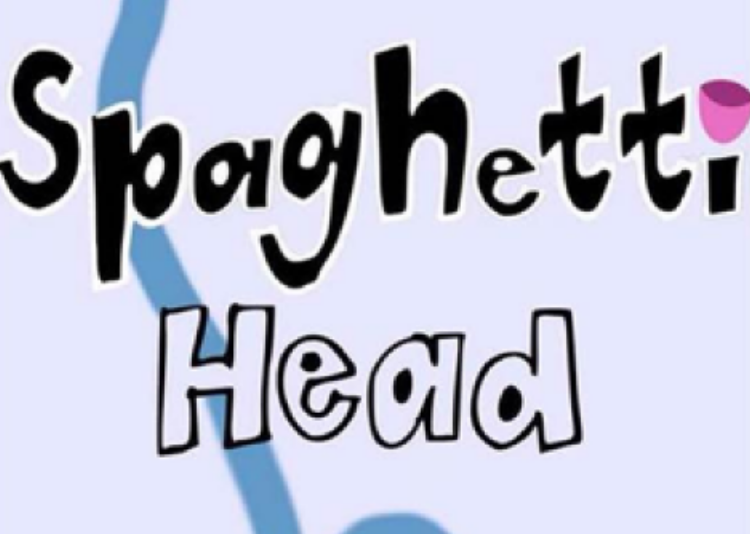
Spaghetti Head Title
Obviously one of the most important areas!
We both agree that a bold font was best to make the name stand out, but to also emphasise the bold statements that Spaghetti Head makes throughout the book.
We wanted a fun font to represent the tongue in cheek personality that the lead character, Nell, has throughout the book.

The pink semicircle on top of the ‘i’ represents a Pink Coconut Shell. This Coconut Shell plays a large role in Nell’s therapy sessions. As part of the therapy, Nell has to revisit past memories to understand them in order to let go of the issues she still holds onto in adult life.
You might be asking what a pink coconut shell has to do with that? Well, you’ll have to read Spaghetti Head to find out!

The Spaghetti Strand (my favourite part)!
What’s the relevance of Spaghetti you might be wondering? Well, here’s Sarah’s description for you:
“I was in a relationship with a man who wasn’t entirely honest, and one day I got to the point where I felt I couldn’t think clearly anymore. My head and my heart were one big jumbled mess. I drew a picture of a massive pile of squiggly lines, and named many of the lines with my emotions. I then tried to figure out how I could get from all of the jumbled squiggles to a nice tidy pile - which I hoped would lead to a calm mind and a calm solar plexus."
As I looked at the drawing, I thought of a big pile of spaghetti - and Spaghetti Head was born!”
Sarah and I both agreed that we liked the idea of having a Spaghetti strand across the front cover.
As you can imagine, it felt like there was an infinite amount of Spaghetti shapes and we were finding it hard to pinpoint the shape we were looking for. I’m based in Dorset and Sarah in France so most of our communication about the cover was done via email or Skype. This made the process of agreeing on the perfect stand a little more time consuming!
Here’s an email snippet so you can visualise how rubbish we were at deciding what spaghetti pattern we liked the most:
“Thanks for adding more squiggles, but that doesn't feel right - and it's an optical illusion - but it makes the page look much wider than the others - bizarre.”
“I like it, but I think the strand is a bit bold, and maybe a bit fat? I think it looks a bit like a snake! I like the left hand side with the loop - maybe follow it with another smaller loop and a twist - something a bit more chaotic.”
So Sarah decided to take it back to basics! Oh how I chuckled when I found this in my inbox on Monday morning:
“Morning, and a Happy Monday to you, it’s been pouring here since Friday evening.
Now then, are you sitting comfortably? At the risk of you disowning me as any blood relation, and being branded totally anal, I have to admit to spending a very happy half hour with a strand of Spaghetti on Saturday night.
The strand on the cover design has been niggling at me, so I threw my Saturday night strand in the air and took photos of my favourite landing configurations. Below is one. I’ll send the other one in next email.”
Here are our finalists:

And how did we narrow it down to one? Here’s another email extract to explain:
“The more I look at the one on the right, the more it looks like a stick figure doing a kind of bicycle-in-the-air gym exercise.”
The squiggly bendy one was the winner! We moved it around a little, but doesn’t it look proud!
So there you have it, the regimented and rigorous process of putting together the Spaghetti Head cover! If you’ve read the book, I think you’ll agree that Nell Greene wouldn’t of had it any other way!